Introduction to Time Series Analysis
Time series analysis is a crucial statistical technique that plays a vital role in decision-making across various industries. This technique involves studying and interpreting data points collected over specific time intervals to identify patterns and trends accurately. Accurate analysis of temporal data is critical in predicting stock market trends, forecasting weather conditions, or managing inventory levels. In finance, it helps develop investment strategies; in meteorology, it aids in predicting severe weather events and saving lives; and in retail, it helps maintain optimal stock levels.
The Python language is well-known for its simple syntax and excellent libraries. This guide provides a solid foundation for understanding and making the most of time series data, setting the stage for more advanced analysis and research. Whether you’re a novice data science enthusiast or a seasoned analyst, the information in this guide will surely be helpful to you.
This Guide covers time series analysis in complete detail. If you want a quick overview, check out this article.
What is Time Series Data?
Time series data is a collection of data points that are recorded or collected at regular intervals and arranged in chronological order. The time stamp associated with each data point indicates the time at which it was recorded. This information is crucial for analyzing patterns and changes in the data over time and can be used to predict future trends.
Cross-sectional data gives you a snapshot of different subjects at a single point in time, whereas time series data tracks the same subject over multiple periods. Cross-sectional data tells us the current stock prices of different companies in the stock market today. Meanwhile, time series data shows the price of one stock over several days, months, or even years.
Real-world examples of time series data are abundant. In economics, it could be a country’s quarterly GDP growth rate. A patient’s heart rate might be monitored over 24 hours in healthcare. For a website, it could be the number of daily visitors. In each case, the data isn't just about the quantity measured; it's about how that quantity changes over time, offering a window into past behavior and a lens through which we can predict future trends.
Understanding time series data and its unique characteristics allows us to study the patterns that cause change over time, paving the way for insightful analysis and informed decision-making.
Getting Started with Python for Time Series Analysis
The Python ecosystem offers a vast array of libraries designed to make your time series data analysis smoother and more efficient. These libraries provide a wealth of functionalities, from data manipulation and visualization to modeling and forecasting, enabling you to explore underlying patterns and trends in your data. In this guide, we introduce you to the most essential libraries and setups to help you unlock the full potential of time series analysis with Python.
The code snippets may not output the exact visuals that I've shown in this tutorial. These Visuals are solely for demonstration purposes.
Try and work with the code on your own data. If you really want to see my code you can take a look here.
Key Python Libraries for Time Series Analysis
Let's start with some of the libraries we'll use throughout this guide.
pandas: The go-to library for data manipulation and analysis, pandas provides user-friendly data structures and functions to work with structured data.numpy: A fundamental package for scientific computing, NumPy offers powerful N-dimensional array objects and tools for integrating C/C++ and Fortran code.matplotlib: A plotting library that produces quality figures in various formats, matplotlib is perfect for visualizing data.statsmodels: This library allows the estimation of statistical models, conducting statistical tests, and exploring statistical data.yfinance: This library lets us retrieve the most up-to-date financial data from Yahoo Finance.scikit-learn: A versatile Python library that offers simple and efficient tools for machine learning, data mining, and data analysis.
Setting Up Your Python Environment
To get started, you'll need Python installed on your computer. If you don't have it, download the latest version from python.org or use a package manager like Anaconda, which has most of the necessary pre-installed libraries.
Once Python is installed, you can install the libraries mentioned above using pip , Python's package installer. Open your command line or terminal and run the following commands:
pip install pandas numpy matplotlib statsmodels yfinance scikit-learn seabornLoading and Handling Time Series Data
pandas is the best for handling and processing time series data. Let's start by loading up the required packages and the data.
Step 1: Importing Libraries
First, open your Python environment or Jupyter Notebook and import the necessary libraries:
import pandas as pd
import numpy as np
import matplotlib.pyplot as plt
import statsmodels.api as sm
import yfinance as yf
import seaborn as sns
Step 2: Loading the Dataset
We’ll use the yfinance library to import the historical data for Microsoft stock prices from Yahoo finance.
msft = yf.Ticker("MSFT")
df = msft.history(period="max")
df['Date'] = df.index
df['Date'] = pd.to_datetime(df['Date'])
Here, df.index specifies the column to use as the row labels of the DataFrame and pd.to_datetime converts the date column to datetime objects, which pandas uses to handle dates and times.
Step 3: Inspecting the Data
It's always a good practice to inspect the first few rows of your dataset:
print(df.head())
Step 4: Handling Time Series Data
To ensure your time series data is sorted by date, you can sort the DataFrame:
df.sort_index(inplace=True)
Let's also get rid of all the columns except the Date and the Close ie. the closing prices.
df.drop(['Dividends', 'Stock Splits', 'Date', 'Open', 'High', 'Low', 'Volume'], axis=1, inplace=True)If you're dealing with missing values, you can interpolate or fill them:
df.fillna(method='ffill', inplace=True)  # Forward fill
# or
df.interpolate(method='time', inplace=True)  # Time-based interpolation
Step 5: Visualizing Time Series Data
With matplotlib, you can quickly visualize your time series data to understand its trends and patterns:
plt.figure(figsize=(16, 8))
plt.plot(df, linewidth=0.8)
plt.ylabel('Price')
plt.xlabel('Date')
plt.title('MSFT Prices')
plt.style.use('ggplot')
plt.show()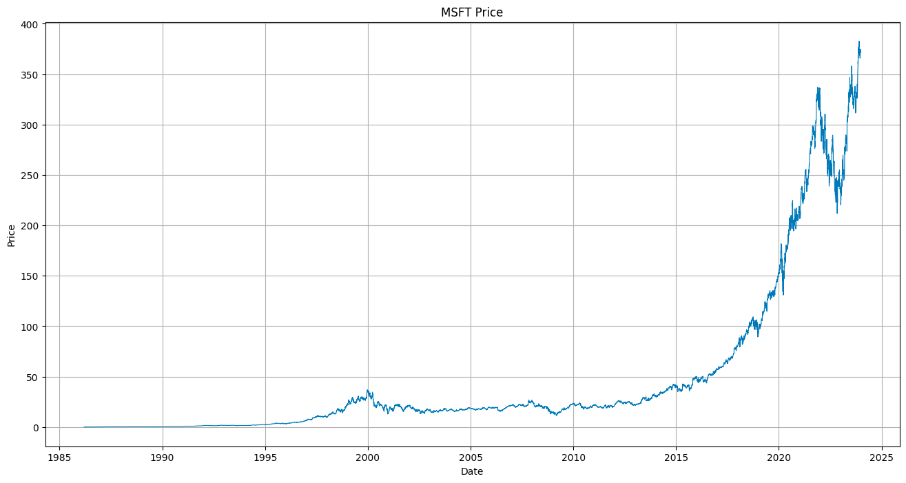
This simple line plot provides a visual overview of your data, with the x-axis representing the Dates and the y-axis the Closing prices.
Step 6: Resampling and Aggregating:
If your data is recorded at too high a frequency, you should resample it to a lower frequency. pandas make this easy:
monthly_df = df.resample('M').mean() # Resample to monthly frequency and compute the mean
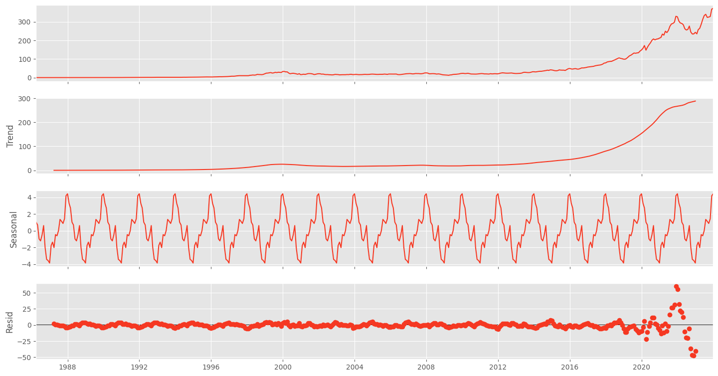
Step 7: Seasonal Decomposition:
To decompose your time series into its trend, seasonal, and residual components, use `statsmodels`:
decomposition = sm.tsa.seasonal_decompose(monthly_df, model='additive')

fig = decomposition.plot()
fig.set_size_inches(16, 8)
plt.show()
This will display a plot with the original time series, the trend component, the seasonal component, and the residuals.
By following these steps, you've now set up a working Python environment for time series analysis and taken the first steps in loading, handling, and visualizing your time series data. As you continue to explore the depths of time series analysis, these tools and techniques will be invaluable companions on your data science journey.
Visualizing Time Series Data
Visualizing time series data is not just about creating pretty charts; it's an essential step in your analytical process. It allows you to observe trends, patterns, outliers, and structural changes that might not be evident from raw data alone. A good visualization can communicate complex data insights in a way that's accessible to any person reading the chart.
The Importance of Visualization
When you visualize time series data, you unlock the ability to:
- Quickly grasp the big picture and identify overall trends.
- Spot seasonal effects, cycles, and repeating patterns over time.
- Detect outliers and anomalies that may warrant further investigation.
- Communicate your findings effectively to stakeholders.
Creating Time Series Plots with matplotlib and seaborn
Let's walk through the process of visualizing time series data using Python's matplotlib and seaborn libraries.
Creating a Line Plot:
A line plot is a basic yet powerful visualization for time series data. Yes, It's the same one we created earlier.
plt.figure(figsize=(10, 5))
plt.plot(df.index, df['YourDataColumn'], color='blue')
plt.title('Time Series Data Over Time')
plt.xlabel('Time')
plt.ylabel('Value')
plt.show()
This plot will show the changes in your data over time, with each point representing a data value at a specific time.
Highlighting Trends with Seaborn:
Seaborn makes it easy to add a trend line to your data:
# Plot the time series
plt.figure(figsize=(10, 5))
sns.lineplot(data=monthly_df, x=monthly_df.index, y='Close')

# Convert the date index to integers
x = monthly_df.index.to_period('D').astype(int)
sns.regplot(data=monthly_df, x=x, y='Close', scatter=False, color='red')

# Add labels and title
plt.title('Time Series Data with Trend Line')
plt.xlabel('Time')
plt.ylabel('Value')
plt.show()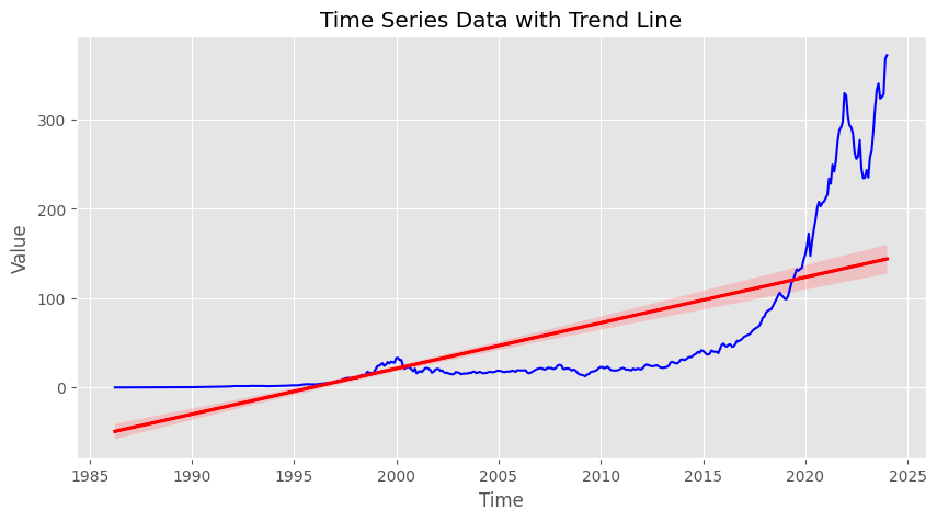
The red line represents the trend in your data, helping you see the general direction in which it’s moving.
Visualizing Seasonality:
If your data has a seasonal component, you might want to visualize it separately
decomposition = sm.tsa.seasonal_decompose(df['YourDataColumn'], model='additive')
seasonal = decomposition.seasonal

plt.figure(figsize=(20, 3))
plt.plot(seasonal.index, seasonal, color='green')
plt.title('Seasonal Component of Time Series')
plt.xlabel('Time')
plt.ylabel('Seasonal Effect')
plt.show()

This plot will help you understand the seasonal fluctuations in your data.
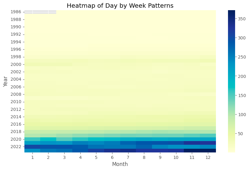
Exploring Patterns with Heatmaps:
Heatmaps can be particularly useful for visualizing more complex patterns, like day-of-week or hour-of-day effects:
# creating a year and month column for the monthly_df
df['Year']=df.index.year
df['Month']=df.index.month

# Pivot your DataFrame to get months as columns and years as rows
pivot_table = monthly_df.pivot(index='Year', columns= 'Month', values='Close')

# Creating the heatmap
plt.figure(figsize=(10, 6))
sns.heatmap(pivot_table, cmap='YlGnBu')
plt.title('Heatmap of Day by Week Patterns')
plt.xlabel('Month')
plt.ylabel('Year')
plt.show()
Following these instructions can create informative visualizations that reveal the hidden stories within your time series data. Remember, the key to effective visualization is not only in the choice of chart type but also in making sure your visualizations are clear, concise, and accurately represent the underlying data.
Making a Time Series Stationary
When delving into the world of time series analysis, one term you'll frequently encounter is "stationarity." A stationary time series is one whose statistical properties, such as mean, variance, and autocorrelation, are constant over time. This stability is crucial because most time series models assume stationarity. It simplifies the modeling process and makes the predictions more reliable.
Why Stationarity Matters
Stationary data is predictable and, hence, more accessible to the model. Non-stationary data, conversely, can contain trends, seasonality, and other structures that may change over time, leading to unreliable predictions. Before proceeding with modeling, you need to transform your non-stationary data into a stationary form.
Testing for Stationarity
Augmented Dickey-Fuller (ADF) test is widely used to determine whether a time series is stationary. It is a statistical test that falls under the category of unit root tests. The ADF test assumes that the null hypothesis is that the time series has a unit root, meaning it is non-stationary. A low p-value (usually less than 0.05) indicates strong evidence against the null hypothesis. Therefore, when the null hypothesis is rejected, it can be inferred that the time series is stationary.
The ADF test helps us understand the data's behavior by examining whether the line is fluctuating or stable. If the line is wiggly, it indicates that the data is unpredictable, and if it’s stable, it’s easier to make predictions. A low number on the test demonstrates that the line is stable and predictable, which can help us identify trends and make informed decisions.
Let's see how to perform the ADF test using Python's statsmodels library:
from statsmodels.tsa.stattools import adfuller

result = adfuller(df['Close'])
print('ADF Statistic: %f' % result[0])
print('p-value: %f' % result[1])
If the p-value is less than 0.05, you can conclude that your time series is stationary.
Making Time Series Stationary
If the ADF test suggests your data is non-stationary, you can apply transformations to stabilize the mean and variance. Two common methods we can use to stabilize the data are differencing and logarithmic transformation.
Differencing
This method involves subtracting the previous observation from the current observation. Differencing can help stabilize the mean of the time series by removing changes in the level of a time series, thus eliminating (or reducing) trend and seasonality.
df['DifferencedData'] = df['Close'].diff()
df['DifferencedData'].dropna().plot()
Now you can run the test again on the differenced data. If the p-value from the Augmented Dickey-Fuller test is greater than your chosen significance level (commonly 0.05). In that case, you fail to reject the null hypothesis that your time series is non-stationary.
Sometimes, the time series might not be stationary after the first difference. In such cases, you can try taking the second difference:
diff2 = df['DifferencedData'].diff().dropna()
Logarithmic TransformationThis method is useful when you want to stabilize the variance of a time series. Applying a logarithmic transformation can help to down-weight large values.
df['LogTransformed'] = np.log(df['Close'])
df['LogTransformed'].plot()
After applying these transformations, it's a good idea to run the ADF test again to check if the time series is now stationary.
from statsmodels.tsa.stattools import adfuller

result = adfuller(df['DifferencedData'])
print('ADF Statistic: %f' % result[0])
print('p-value: %f' % result[1])
By ensuring your time series data is stationary, you lay the groundwork for building robust and effective forecasting models. Stationarity bridges your raw, real-world data to the predictive insights that can drive informed decisions.
Decomposing Time Series Data
Time series decomposition is a powerful analytical tool that separates a time series into its fundamental components: trend, seasonality, and residuals. This breakdown makes understanding complex time series data easier and can improve the forecasting model's performance.
Understanding Time Series Decomposition
The trend component represents the direction the data moves over a long period. Seasonality shows regular patterns that repeat over a known period, such as daily, monthly, or quarterly. The residual component, sometimes called "noise," remains after the trend and seasonal components have been removed; it represents the randomness or irregularities in the data.
Decomposing a Time Series Using statsmodels
Python's statsmodels library provides a seasonal_decompose function that automatically decomposes a time series. We've done this earlier when we were visualizing the seasonality.
Step 1: Importing the Library
First, ensure you have imported the necessary module from statsmodels:
from statsmodels.tsa.seasonal import seasonal_decompose
Step 2: Applying the Decomposition
Assuming you have a pandas DataFrame with a datetime index, you can apply the decomposition as follows:
# The frequency is the number of data points in a seasonal period
# For example, if your data is monthly and shows yearly seasonality, the frequency is 12
decomposition = seasonal_decompose(df['YourDataColumn'], model='additive', period=12)

# Retrieve the decomposed components
trend = decomposition.trend
seasonal = decomposition.seasonal
residual = decomposition.resid
The model parameter can be either 'additive' or 'multiplicative,’ depending on the nature of the time series.
Step 3: Visualizing the Components
You can visualize the decomposed components using matplotlib:
plt.figure(figsize=(12,8))

plt.subplot(411)
plt.plot(monthly_df['Close'], label='Original')
plt.legend(loc='best')

plt.subplot(412)
plt.plot(trend, label='Trend')
plt.legend(loc='best')

plt.subplot(413)
plt.plot(seasonal,label='Seasonality')
plt.legend(loc='best')

plt.subplot(414)
plt.plot(residual, label='Residuals')
plt.legend(loc='best')

plt.tight_layout()
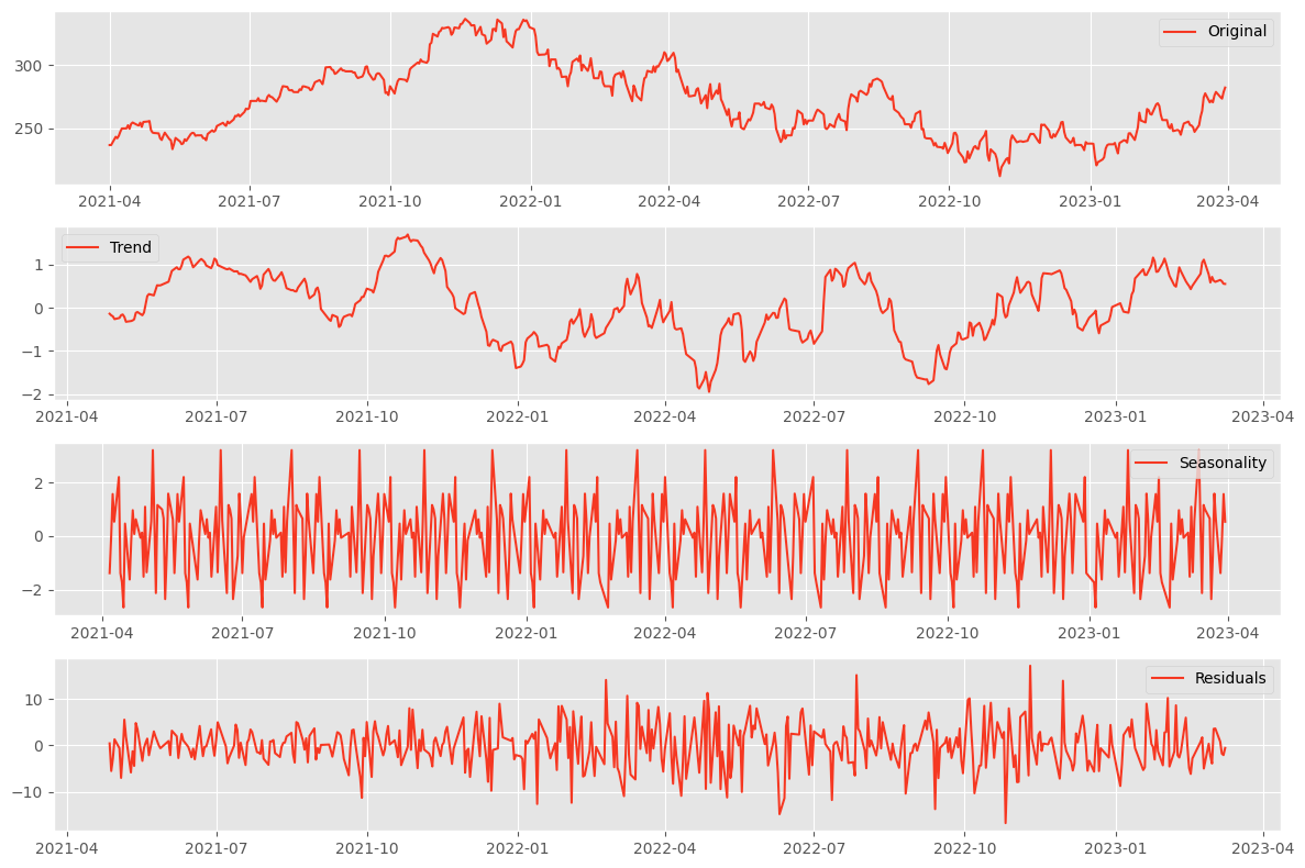
Interpreting the Results
Each subplot gives you a clearer picture of the underlying patterns in your data:
- The trend component shows the overall direction and pace at which the series is evolving.
- The seasonality reveals any regular patterns that repeat at fixed intervals.
- The residuals display irregularities and might indicate outliers or unexpected events.
Understanding these components can help you tailor your forecasting models to account for the underlying patterns. For instance, if you detect strong seasonality, you might use a seasonal forecasting method. A trend component in your model could improve accuracy if the trend is pronounced.
Decomposition is a diagnostic step that helps you understand the 'why' behind the 'what' of your time series data. It's a critical process that informs better modeling and, ultimately, better decision-making.
Basic Forecasting Methods
After analyzing and decomposing time series data, the next logical step is forecasting future values. Two simple yet effective forecasting methods are moving averages and exponential smoothing. Before diving into more complex models, these techniques can be a good starting point.
Moving Averages
Moving averages smooth out short-term fluctuations and highlight longer-term trends or cycles. The simplest form is the rolling mean, where you calculate the average of the current and preceding data points within a specified window size.
# Calculate the moving average using a window of 5 periods
df['Moving_Avg'] = df['YourDataColumn'].rolling(window=5).mean()

# Plot the original data and the moving average
plt.figure(figsize=(10, 5))
plt.plot(df['YourDataColumn'], label='Original')
plt.plot(df['Moving_Avg'], label='Moving Average', color='red')
plt.legend(loc='best')
plt.show()
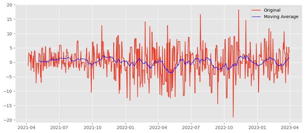
Pros:
- Simple to understand and easy to implement.
- Effective in smoothing out noise and identifying trends.
Cons:
- Lagging indicator: It inherently lags behind the actual data because it's based on past values.
- Not responsive to sudden changes or seasonal effects.
Exponential Smoothing
Exponential smoothing assigns exponentially decreasing weights to past observations. The most recent data points are given more weight, making them more responsive to changes.
from statsmodels.tsa.api import SimpleExpSmoothing

# Fit the model
model = SimpleExpSmoothing(df['YourDataColumn']).fit(smoothing_level=0.2)

# Forecast the next five periods
df['Exp_Smooth'] = model.forecast(5)

# Plot the original data and the exponential smoothing
plt.figure(figsize=(10, 5))
plt.plot(df['YourDataColumn'], label='Original')
plt.plot(df['Exp_Smooth'], label='Exponential Smoothing', color='green')
plt.legend(loc='best')
plt.show()
Pros:
- More responsive to recent changes than moving averages.
- It is still relatively simple to implement and understand.
Cons:
- Choosing the correct smoothing factor (alpha) can be subjective.
- It may still lag when there are sudden changes in the trend.
Both moving averages and exponential smoothing are foundational forecasting methods that can provide insights into your time series data. They are instrumental when you have a large amount of data and need a quick, rough estimate of future trends. However, more sophisticated models may require more accurate and responsive forecasts, especially in complex patterns like seasonality or cycles.
Introduction to ARIMA Models
As we venture deeper into forecasting, we encounter ARIMA models, A.K.A AutoRegressive Integrated Moving Averages. ARIMA models are widely used in time series analysis due to their flexibility and robustness in capturing various data patterns.
Understanding ARIMA Models
ARIMA models combine three fundamental concepts: autoregression, integration, and moving averages. These components work together to model different aspects of the time series data.
Autoregression (AR): Leverages the relationship between a current observation and a specified number of lagged observations (previous time points). The term 'p' in ARIMA(p,d,q) refers to the order of the autoregressive part and indicates the number of lagged terms to include.
Integration (I): Integration involves differencing the time series data one or more times to make it stationary, which is crucial for the AR and MA parts to perform well. The 'd' in ARIMA(p,d,q) represents the degree of differencing required.
Moving Averages (MA): The MA component models the relationship between an observation and a residual error from a moving average model applied to lagged observations. The 'q' in ARIMA(p,d,q) specifies the order of the moving average component, indicating the number of lagged forecast errors to include.
Implementing ARIMA Models in Python
Python's statsmodels library offers a comprehensive suite of tools for implementing ARIMA models. Here's a glimpse of how you can fit an ARIMA model to your time series data:
from statsmodels.tsa.arima.model import ARIMA

# Fit an ARIMA model
# The order (p,d,q) needs to be determined using model diagnostics and AIC/BIC criteria
model = ARIMA(df['YourDataColumn'], order=(1,1,1))
results = model.fit()

# Summary of the model
print(results.summary())

# Forecasting future values
forecast = results.forecast(steps=5)

# Plot the original data and the forecast
plt.figure(figsize=(10, 5))
plt.plot(df['YourDataColumn'], label='Original')
plt.plot(forecast, label='Forecast', color='purple')
plt.legend(loc='best')
plt.show()
This code snippet provides a basic structure for fitting an ARIMA model. However, selecting the optimal order (p,d,q) is a critical step that involves careful analysis and model validation, which we'll cover in a detailed guide in a subsequent blog post.
ARIMA models are a potent tool in the forecaster's arsenal, capable of modeling a wide array of time series data. While they require a deeper understanding of their underlying mechanics and careful tuning of their parameters, the insights they can provide are well worth the effort.
We've only scratched the surface of ARIMA models in this gudie. Subscribe to Dashrepo.com and stay tuned for a more detailed and complete guide on ARIMA Models.
Evaluating Time Series Models
Once you've developed a forecasting model, assessing its performance is crucial. Evaluation ensures that your model can accurately predict future values and provide reliable insights. With proper evaluation, you can avoid making decisions based on flawed predictions, which can have significant consequences.
Why Model Evaluation Matters
Evaluating the accuracy of forecasting models helps you to:
- Determine how well the model has captured the underlying patterns in the data.
- Compare different models to select the best one for your specific needs.
- Identify areas of improvement for current models.
Common Evaluation Metrics
Several metrics can be used to evaluate the accuracy of time series models. Three of the most common are Mean Absolute Error (MAE), Root Mean Squared Error (RMSE), and Mean Absolute Percentage Error (MAPE).
Mean Absolute Error (MAE) measures the average magnitude of the errors in a set of predictions without considering their direction. It's the mean of the absolute values of the individual prediction errors.
Root Mean Squared Error (RMSE) is the square root of the average squared differences between prediction and actual observation. It gives a relatively high weight to significant errors, which can be useful when significant errors are undesirable.
Mean Absolute Percentage Error (MAPE) measures the size of the error in percentage terms. It's calculated as the average of the absolute percentage errors of the predictions.
Calculating Evaluation Metrics in Python
Python makes it easy to calculate these metrics using the sklearn.metrics package:
from sklearn.metrics import mean_absolute_error, mean_squared_error

# Assuming 'actuals' is a pandas Series of actual values and 'predictions' is of forecasted values
actuals = df['Actuals']
predictions = df['Predictions']

# Calculate MAE
mae = mean_absolute_error(actuals, predictions)
print(f'Mean Absolute Error (MAE): {mae}')

# Calculate RMSE
rmse = mean_squared_error(actuals, predictions, squared=False)
print(f'Root Mean Squared Error (RMSE): {rmse}')

# Calculate MAPE - Note: We avoid division by zero and handle the case where actuals can be zero
mape = np.mean(np.abs((actuals - predictions) / np.clip(actuals, a_min=0.0001, a_max=None))) * 100
print(f'Mean Absolute Percentage Error (MAPE): {mape:.2f}%')
Each of these metrics provides a different perspective on the accuracy of your model. MAE is easy to interpret, while RMSE is more sensitive to errors. MAPE provides a relative measure of error, which can be more intuitive, especially when communicating with stakeholders.
By utilizing these metrics, you can gauge the performance of your time series models and make informed decisions about which model to deploy for your forecasting needs. Remember, no model will be perfect, but you can ensure your model is as accurate and reliable as possible through careful evaluation.
Summing Up
In this comprehensive guide, we've covered most of the essential concepts and techniques.
- We began by defining time series data and its unique characteristics, setting the stage for the importance of stationarity and the methods to achieve it.
- We then introduced the key Python libraries and walked through the steps to load, handle, and visualize time series data.
- We then talked about stationarity and its significance in time series analysis. We discussed the Augmented Dickey-Fuller test and how to apply transformations to make your data stationary.
- We explored the art of decomposition, breaking down time series into trends, seasonality, and residuals to better understand the underlying patterns.
- Moving into forecasting, we discussed simple yet effective methods like moving averages and exponential smoothing, providing Python code examples to implement these techniques.
- We then stepped into the realm of ARIMA models, a more advanced forecasting approach that captures complex data patterns.
- Evaluating the accuracy of our forecasting models is crucial, and we introduced standard metrics such as MAE, RMSE, and MAPE, along with Python snippets to calculate them. These metrics help ensure the reliability of our predictions and guide us in selecting the best models for our needs.
Next Steps
As you start working on your time series analysis projects, I encourage you to apply these techniques to your datasets. Experimentation and practice are the keys to mastery; there’s no substitute for hands-on experience.
Stay tuned for our upcoming posts that will dive deeper into the different advanced time series forecasting models with python.
Please share your thoughts and feedback in the comments below.It is invaluable and will help me create better content.
Remember to subscribe to the blog and follow me on twitter for a continuous stream of data science knowledge. You'll get updates on future posts, industry news, and tips. Join our community and stay at the forefront of AI and Data Science.